Home services / UX leadership
Raha app redesign.
Making a complex home services experience feel clear, personal, and trustworthy.
The challenge
Raha is an established domestic labor platform in Saudi Arabia. As the product grew, fragmented flows and accumulated complexity made everyday tasks harder. I led an end-to-end redesign, connecting user research, business priorities, and a new design system.
Leading the process
I owned UX strategy, UI direction, and the design system from research to handoff. I worked with product, engineering, and business stakeholders, while mentoring a junior designer and a UX writer.
Research combined desk research, customer support ticket analysis, competitive analysis, user interviews, and heuristic evaluation. Five stakeholder workshops, eight internal sessions, and five one-on-one sessions turned the findings into product decisions.
Design decisions
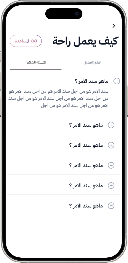
A simpler start
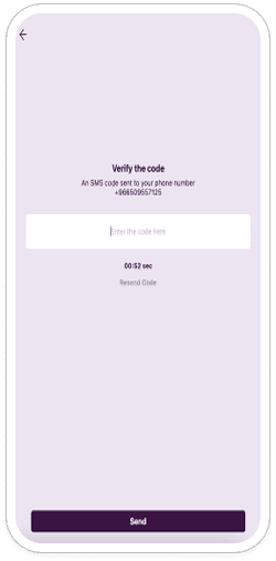
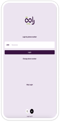
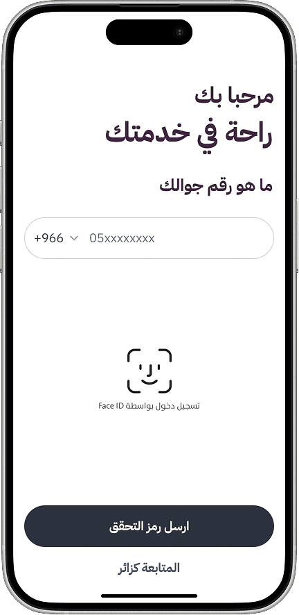
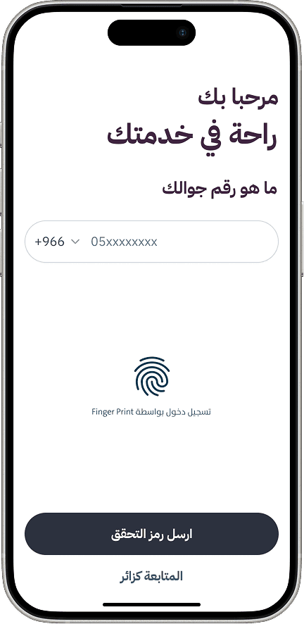
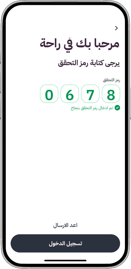
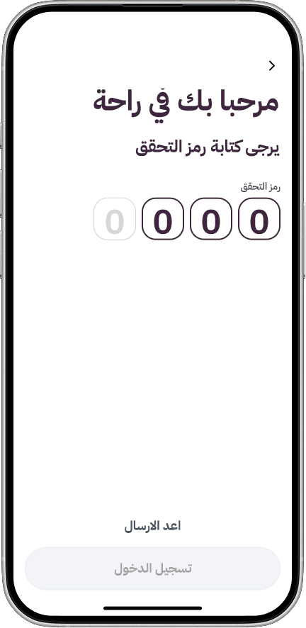
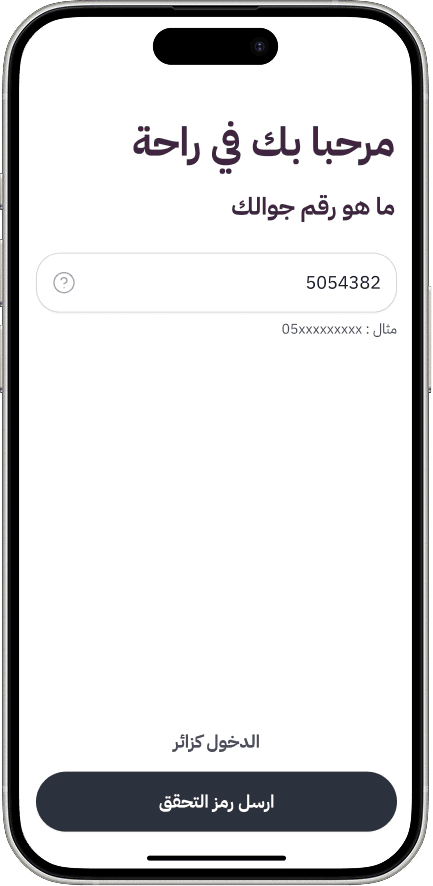
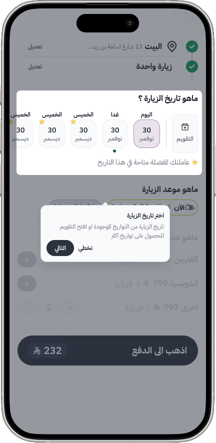
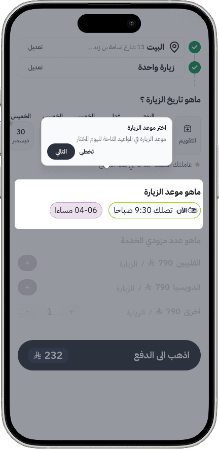
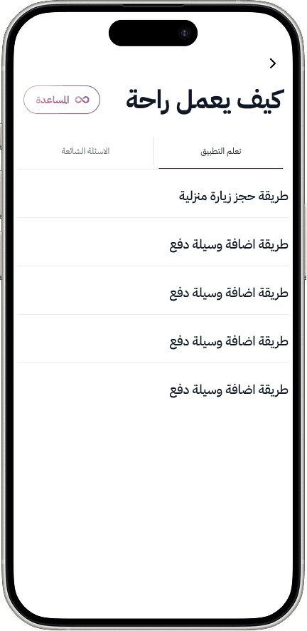
Replaced high-friction sign-in with a mobile number and OTP. Removed ID and unnecessary fields, then added walkthroughs, contextual hints, and on-demand guidance.
A home that understands context
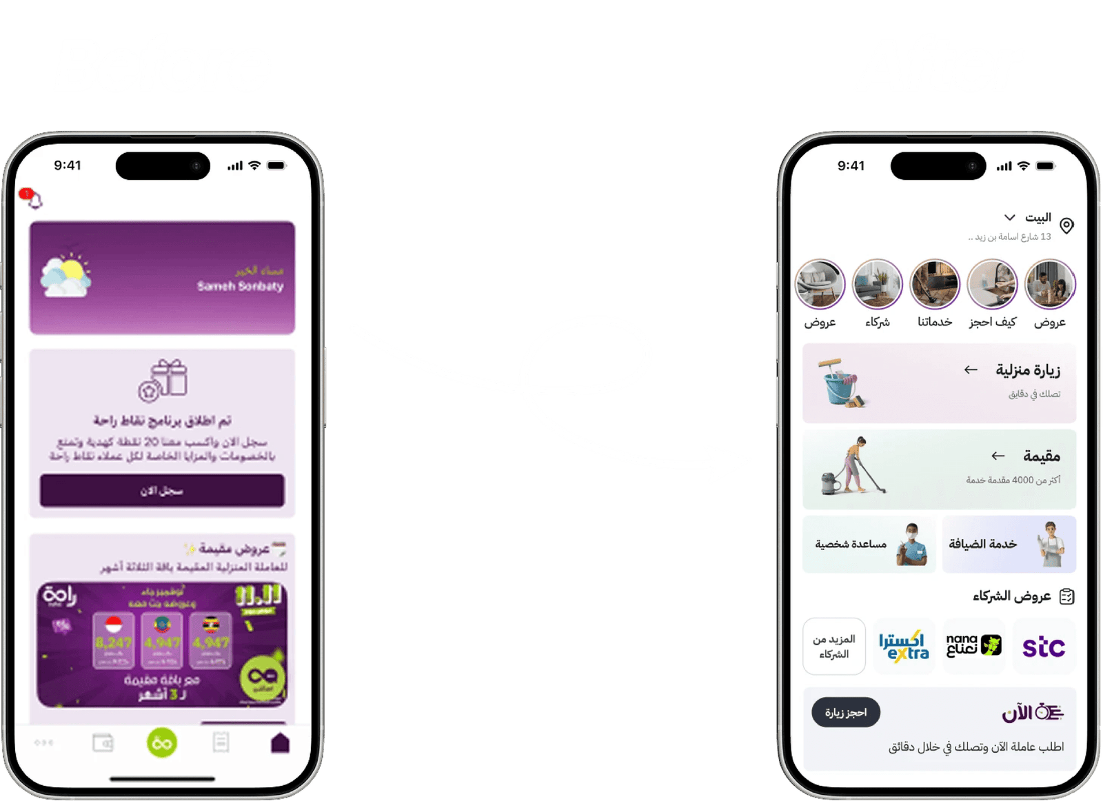
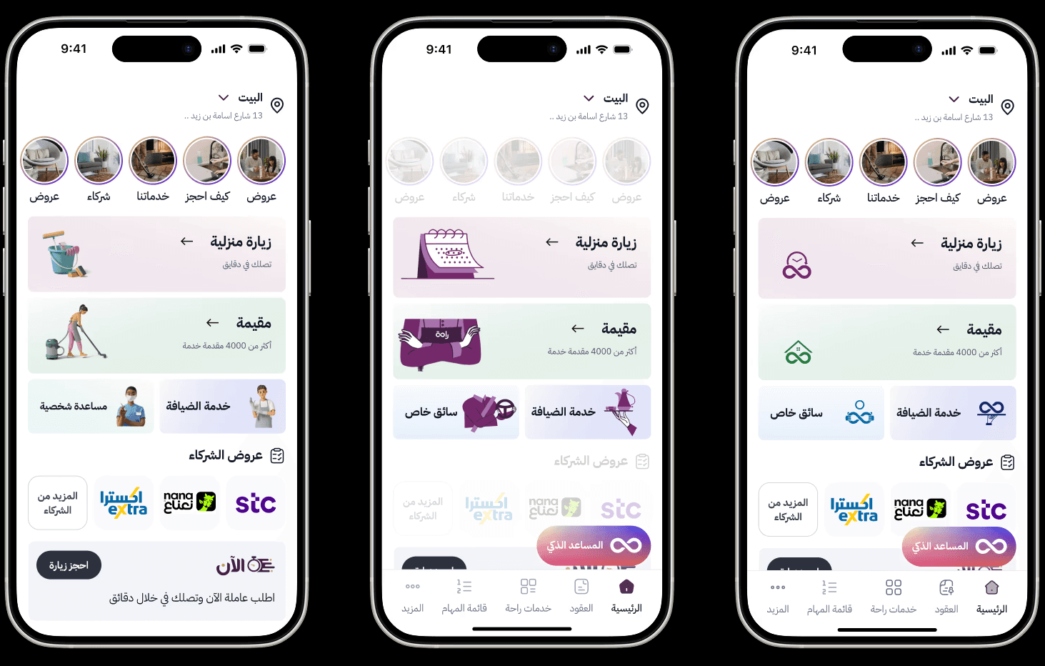
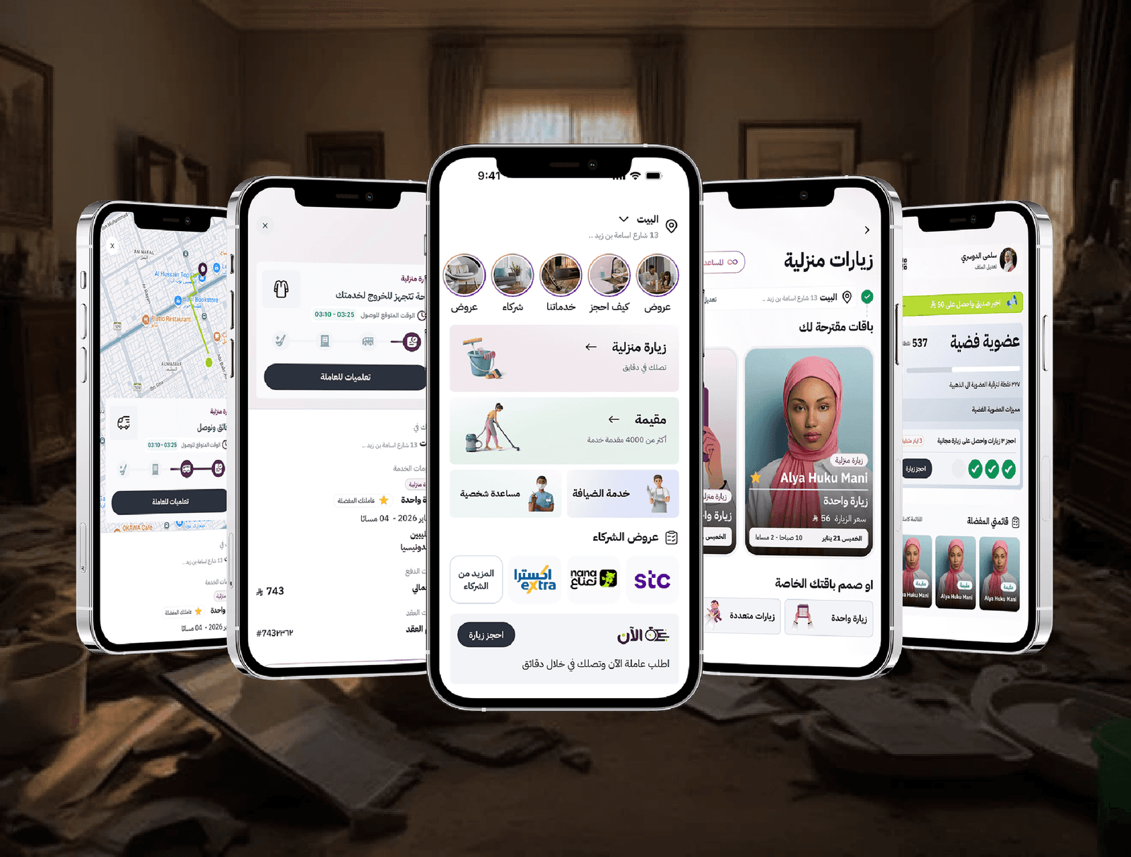
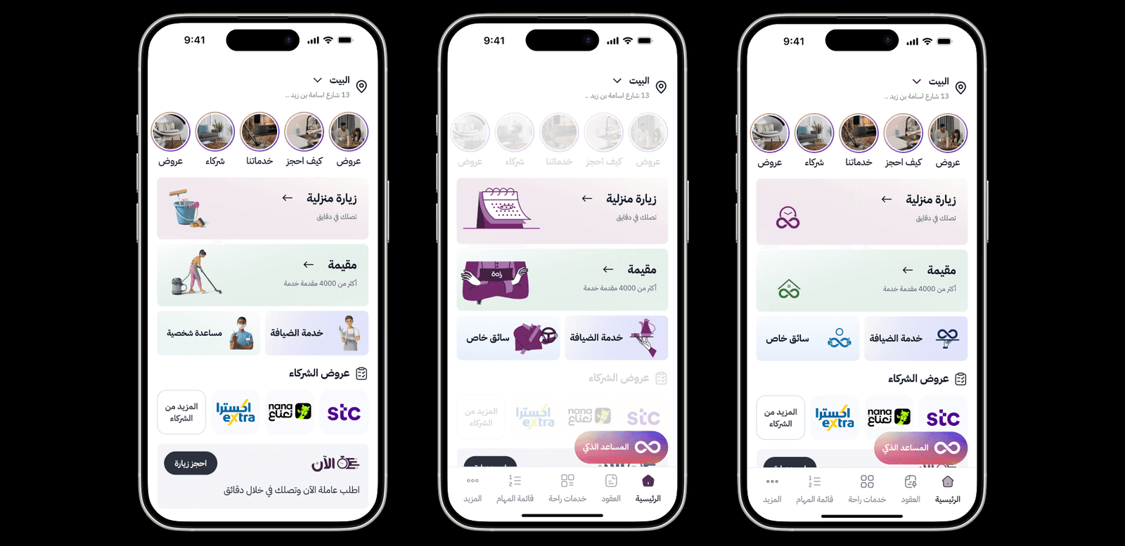
Designed more than 20 home states around active tracking, upcoming visits, workers at home, invoices, offers, and user status.
More reasons to return
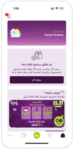
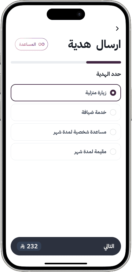
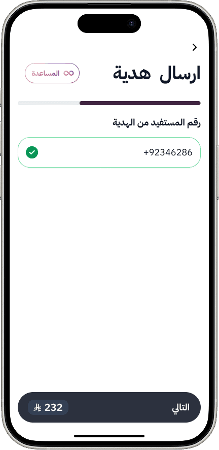
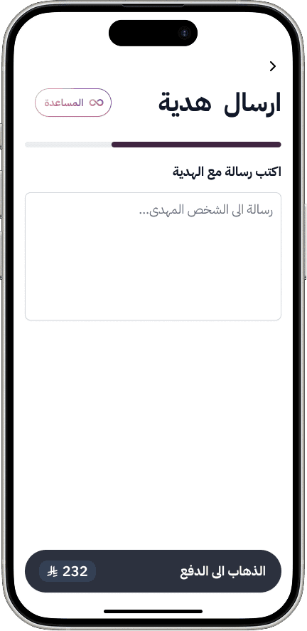
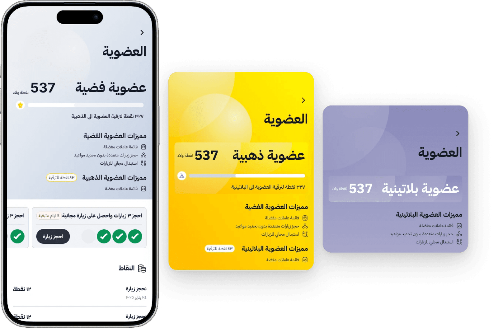
Created Silver, Gold, and Platinum loyalty tiers, rewards and bundles. Gifting became a dedicated journey with personalized messages and real family support scenarios.
Booking with confidence
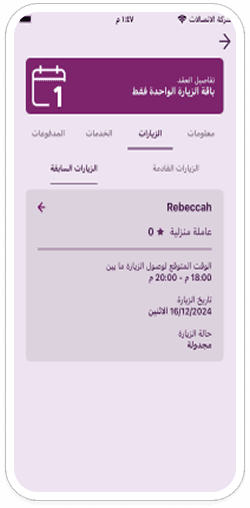
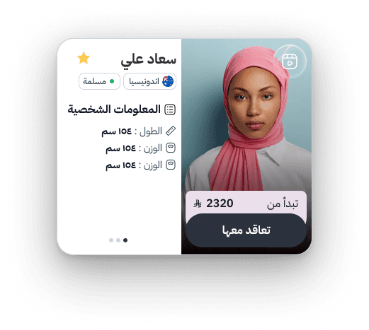
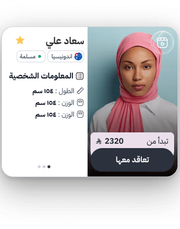
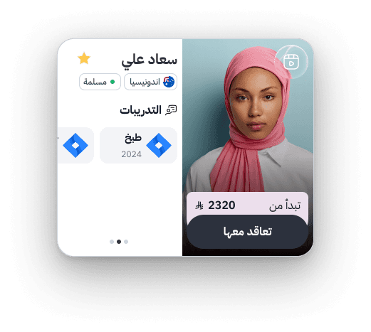
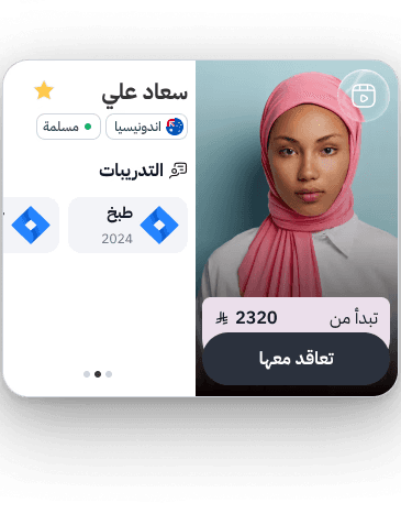
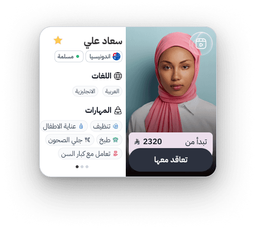
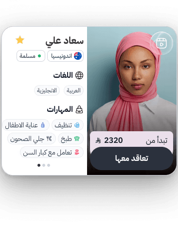
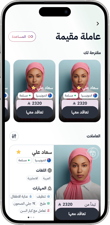
Removed a countdown that caused stress and booking mistakes. Rich worker profiles introduced photos, video, skills, and experience before arrival.
Help that is easy to find
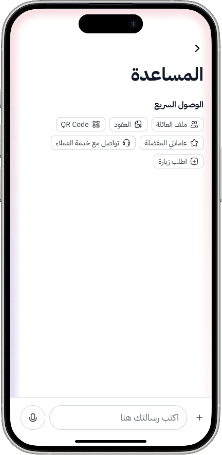
Gave the AI chatbot a recognizable identity, made it available throughout the app, and added quick access to human support.
The outcome
The redesign creates a foundation for clearer onboarding, more relevant actions, repeat usage, and trust before booking. Next steps include usability testing, iteration, design handoff, and implementation.
Explore the research, individual flows, and rationale behind each improvement in the project notes below.
Explore the details
Go deeper into the research, design rationale, and complete interface explorations.
Read the complete project notes
Overview
When I joined SMASCO, Raha was already an established domestic labor app in Saudi Arabia. However, scale alone doesn’t guarantee a great experience. Over time, the product accumulated usability issues, fragmented flows, and growing complexity that no longer matched users’ expectations or business ambitions.
The challenge wasn’t just to improve the existing app - it was to rethink the entire experience while keeping millions of active users in mind.
My Role
Product Design Lead
Led the end-to-end design process from research to handoff
Owned UX strategy, UI direction, and design system creation
Led ideation with stakeholders and internal teams
Mentored a junior designer and a UX writer
Worked closely with product, engineering, and business teams
Understanding the Business First
Before designing anything, I focused on understanding the business context.
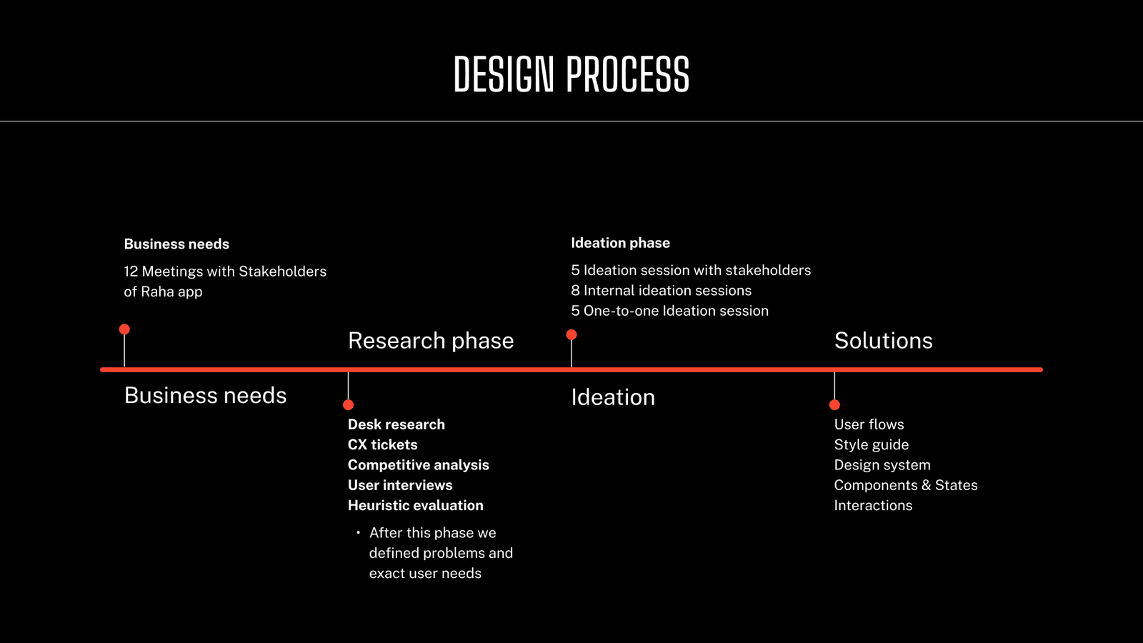
I conducted 12 in-depth meetings with Raha stakeholders, including product owners and leadership, to align on:
Business goals and KPIs
Operational constraints
Growth challenges
Known user complaints and risks
This step helped frame the redesign as a business-driven UX initiative, not just a visual upgrade.
Researching at Scale
With clear business objectives in place, I led a comprehensive research phase to uncover real user problems.
We combined multiple research methods:
Desk research to understand the market and domain
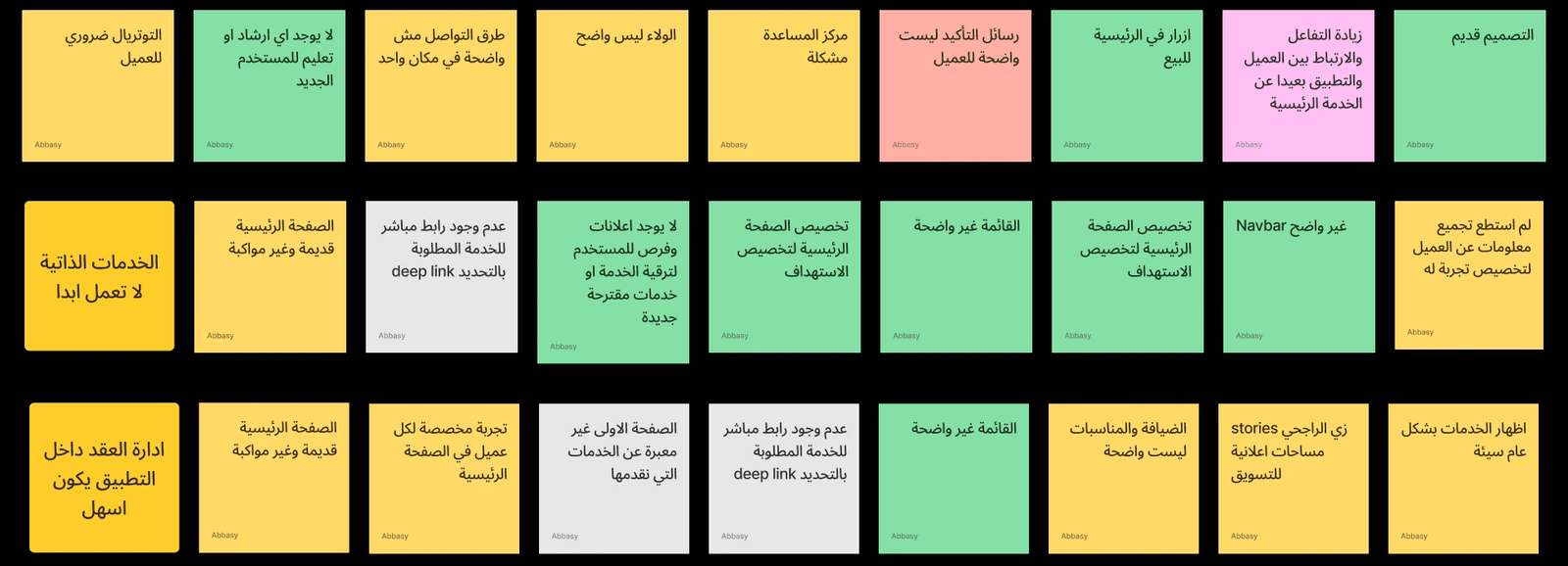
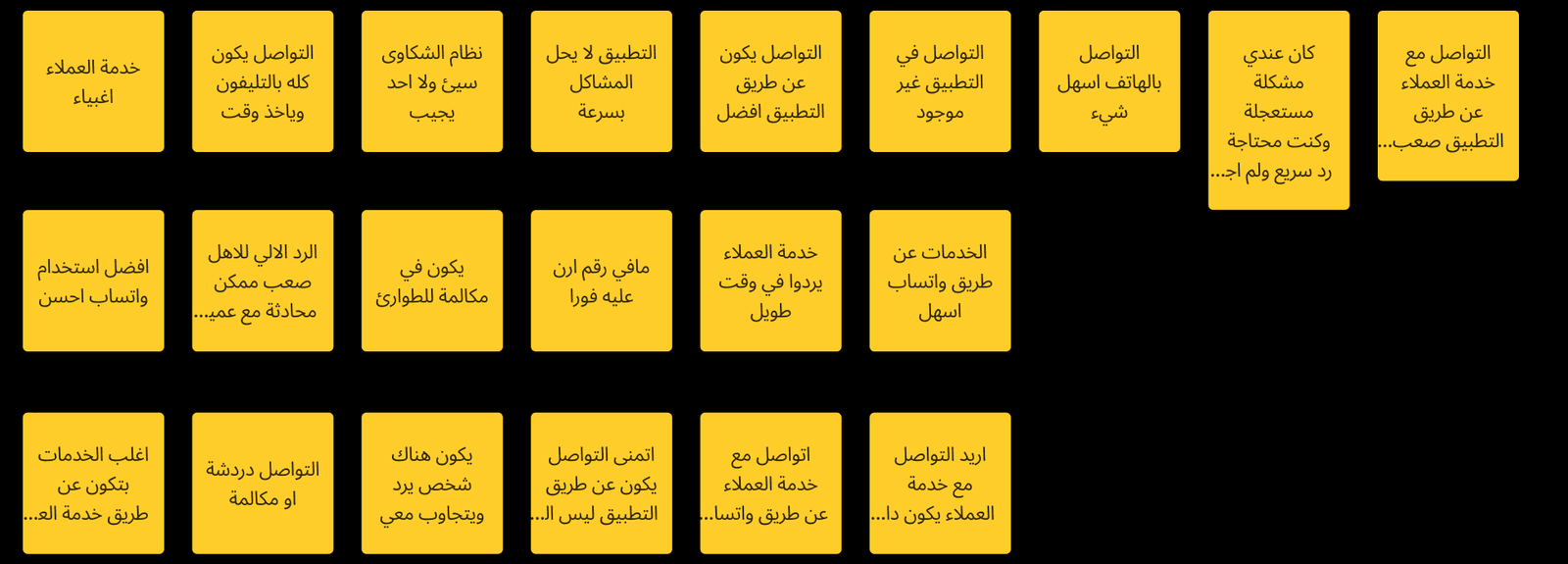
CX ticket analysis to identify recurring user frustrations
Competitive analysis to benchmark industry standards
User interviews to capture real behaviors and expectations
Heuristic evaluation to expose usability and accessibility issues
By the end of this phase, we had a clear understanding of what was broken, why users struggled,
and what they actually needed.
Turning Problems into Ideas
To transform insights into solutions, I facilitated a structured ideation process involving all key stakeholders.
5 ideation workshops with business stakeholders
8 internal ideation sessions with the design team
5 one-on-one ideation sessions for deep problem-solving
This approach ensured alignment between user needs, business goals, and technical feasibility.
Sign In & Authentication
Problem: High friction during login.
What I did
Simplified sign-in to mobile number + OTP only
Removed ID and unnecessary fields
Followed global conversion best practices
Impact
Higher conversion rate
Faster onboarding
Lower drop-off at entry point
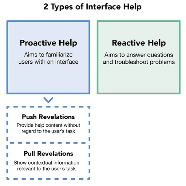
Interface Guidance
Goal: Help users without overwhelming them
Proactive help:
Intro walkthroughs
Contextual hints (pull revelations)
Reactive help:
On-demand guidance
Troubleshooting tips
Impact:
Better feature discovery
Reduced confusion early on
Home Page (Core Experience)
Problem:
Old home page was rigid and ad-focused
Same layout for all users regardless of their state
Solution:
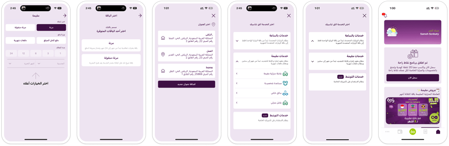
Designed a fully personalized & flexible home page
Home content adapts based on:
Active tracking
Upcoming visits
Existing worker at home
Invoices
Flash sales
User status
Designed 20+ different home page states
Faster access to relevant actions
Strong personalization signal
Higher engagement
Gamification & Loyalty Program
Goal: Increase retention & repeat usage
What I built
Full loyalty system:
Silver / Gold / Platinum tiers
Reward-based motivation
Scarcity mechanics:
Limited offers
Bundle offers:
Buy 3 visits → get 1 free
Stronger emotional attachment
Increased repeat orders
Higher user retention
Gifting Experience
Gifting was hidden and unclear
Treated as a secondary action after booking
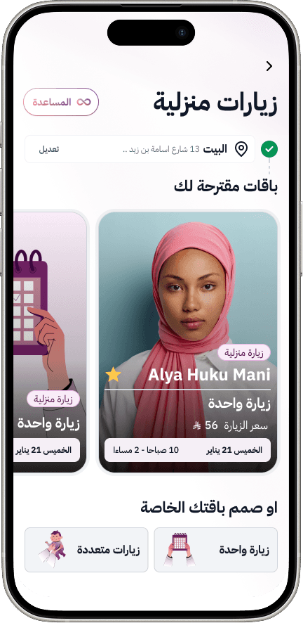
Designed gifting as a standalone product
Dedicated gifting flow
Real-life scenarios:
Monthly worker as a gift
Family support use cases
Personalized gifting messages
New engagement channel
Higher gifting adoption
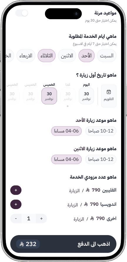
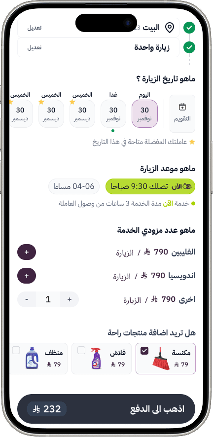
Single Visit Booking Flow
Problem
Countdown timer caused stress
Users booked wrong dates by mistake
Solution
Removed the timer completely
Smoothed the booking flow
Allowed users to choose calmly
Fewer booking mistakes
Reduced support complaints
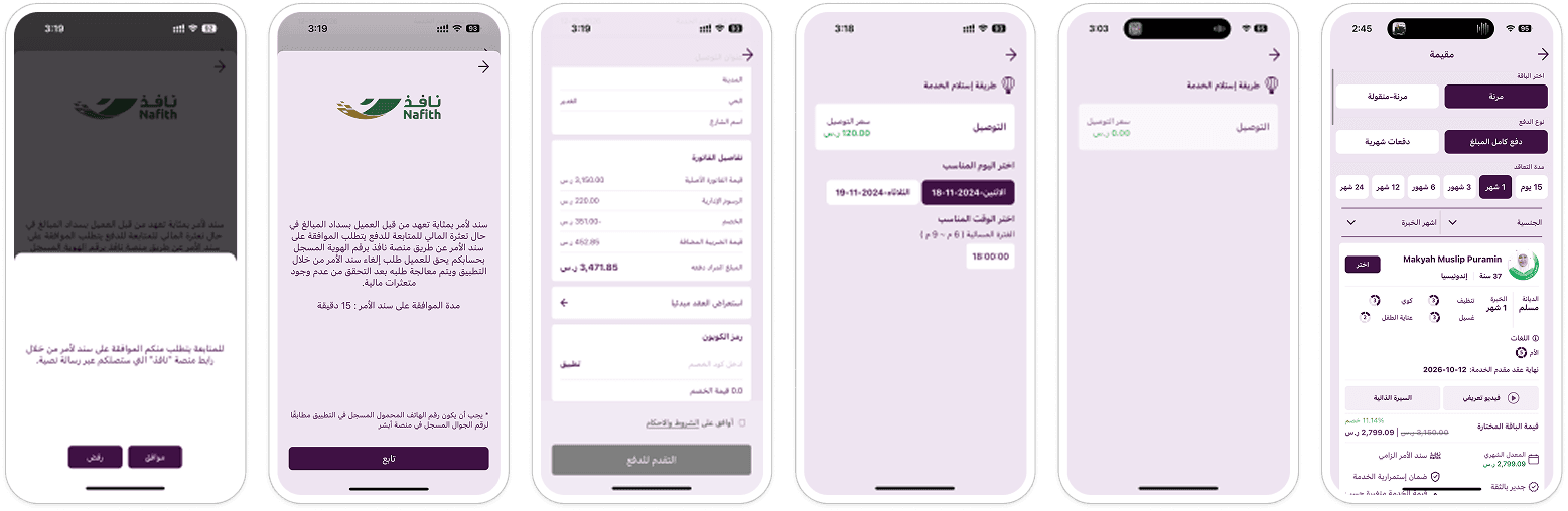
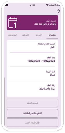
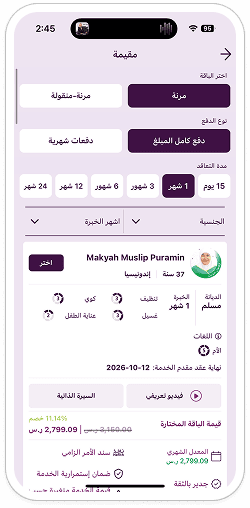
Muqeemah Contract - Trust Building
High worker replacement rate
Users shocked by worker appearance after arrival
Insights:
From user interviews & CX tickets:
Lack of familiarity
Low trust before arrival
Rich worker profiles:
Multiple photos
Videos
Clear skills & experience
Focused on making the worker familiar before arrival
Increased trust
Reduced replacement requests
AI Help & Customer Support
AI chatbot existed but was underused
Hard to access support quickly
Redesigned AI chatbot visual identity
Made it clearly recognizable as AI
Available across all app screens
Quick access to human agents
Faster problem resolution
Better support experience
Lower frustration
This wasn’t about making Raha look better. It was about making a complex, high-impact service easier, clearer, and more trustworthy for millions of users.
What’s Next
The project is now moving into:
Usability testing
Iterative enhancements
Full design handoff and implementation
This redesign represents not just a new interface, but a long-term product foundation for Raha’s next phase of growth.
Explore all 45 design visuals